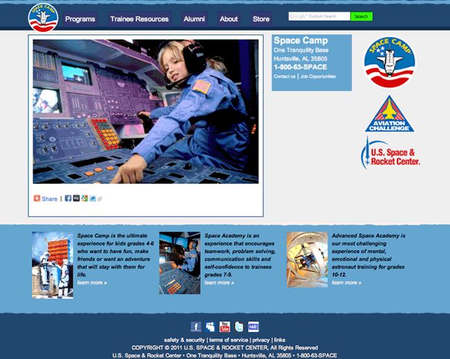
Space Camp has gained a new look to its websites!
The look of the new site was first previewed on the Community site that launched earlier this month.
At the time it launched, I thought the Community site had a nice, clean look to it, and that look fits nicely with the rest of the site.
Each Space Camp site (Space Camp, Aviation Challenge, and USSRC) all have their own color scheme while retaining the same layout, look, and feel (though the USSRC one reminds me of something I can’t quite place my finger on), each with their own navigation options on the top of the page. The navigation options are mostly unique, but common where appropriate. For example, the SC and AC sites both support “Alumni” tabs at the top.
Overall, it’s a modern, clean look for Space Camp!

